
Typography
Meet our brand typefaces.
Our primary brand typeface is Open Sans. Open Sans is a sans-serif typeface designed by Steve Matteson and commissioned by Google. According to Google, it was developed with an "upright stress, open forms and a neutral, yet friendly appearance" and is "optimized for legibility across print, web, and mobile interfaces."
Our secondary brand typeface is Source Sans Pro. Source Sans Pro is a sans serif typeface created by Paul D. Hunt for Adobe Systems. It is the first open-source font family from Adobe and was created to demonstrate exemplary design quality, technical fidelity, and aesthetic longevity.
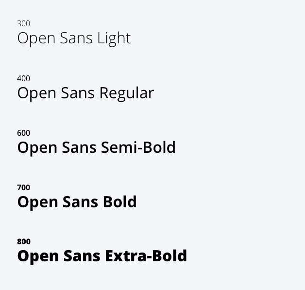
Open Sans
Open Sans comes in five weights and is used for short headlines that are usually 18px or more in size and always fewer than 500 characters.
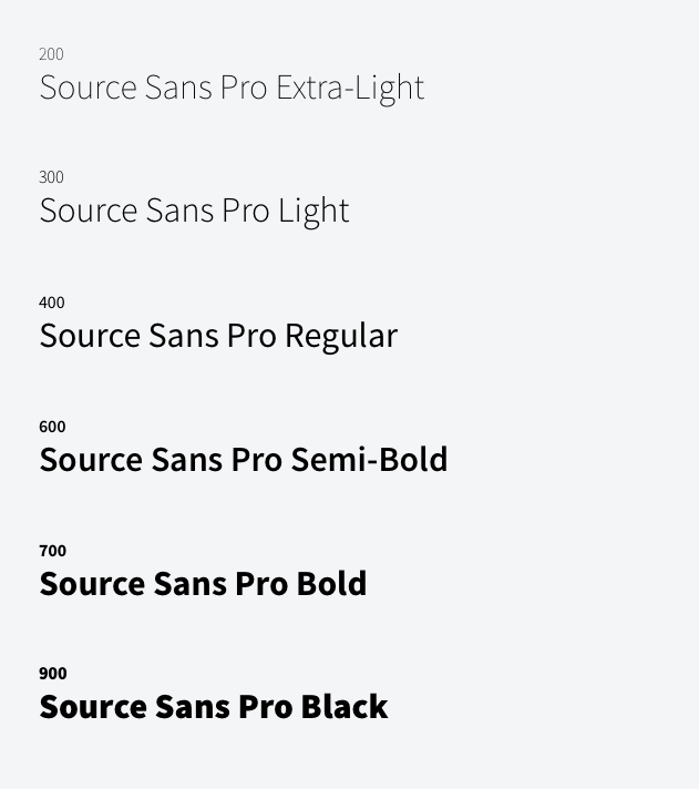
Source Sans Pro
Source Sans Pro comes in six weights and is intended to work well in user interfaces. We use it for anything 18px or less.
Typography Colors
We mostly use the neutral palette for typography, but will make exceptions here and there - mostly for campaigns and interactive elements like text links. See the color usage guidelines for more information.