Logos
Our visual language reflects our values and our community. Simple, yet diverse. Understated and timeliness, yet bold and vibrant. Here are tips for when you’re representing our brand. Downloadable versions of the company and product logos are available under the Resources - Logos.
Company Logo
This is our primary logo. Note the horizontal lockup.
When the primary logo doesn’t fit your composition, use the vertical lockup.
Clearspace
For both horizontal and vertical layouts the clearspace around the logo should be equal to the "e" on all sides.
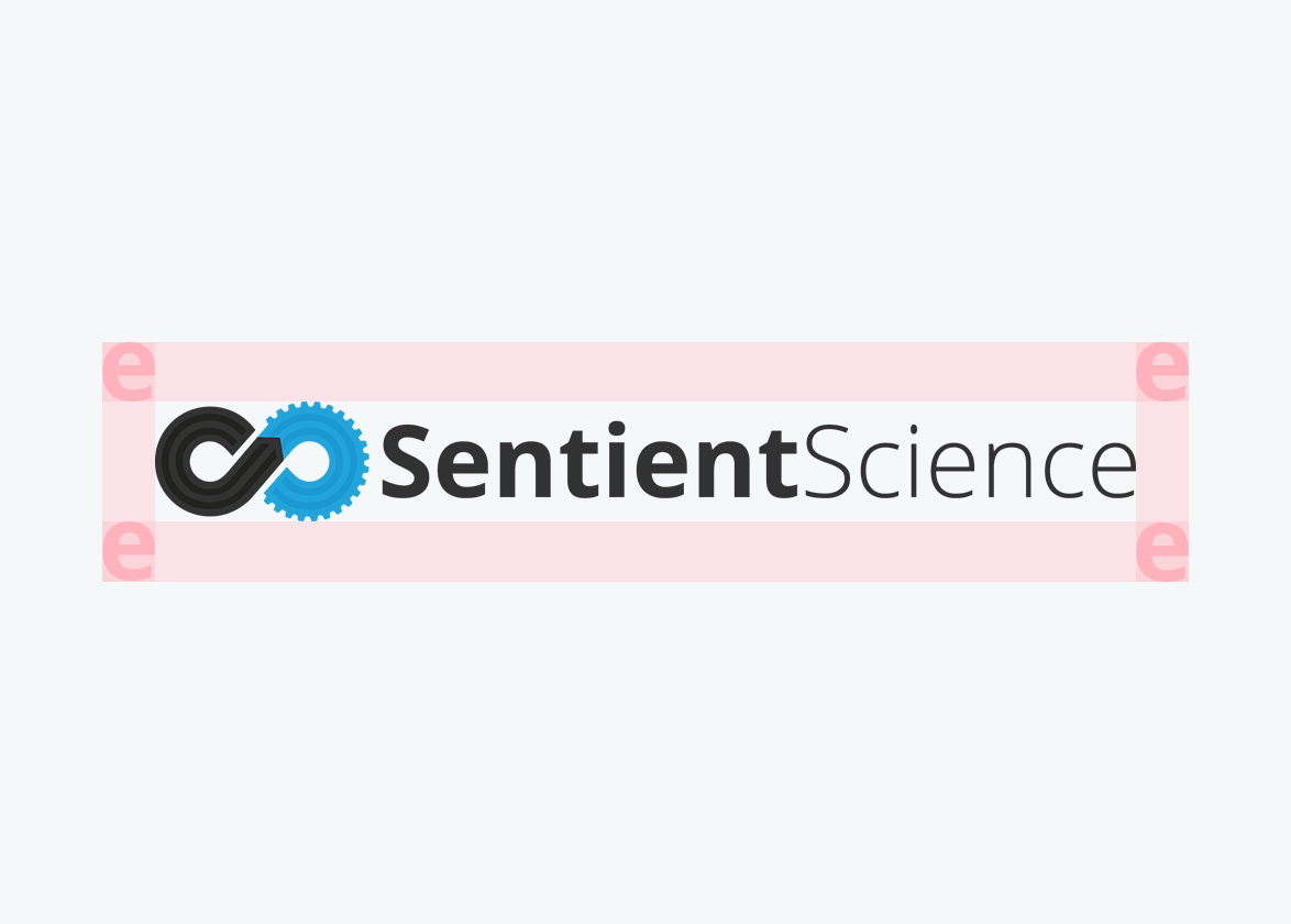
Our logo should always have space to breathe.
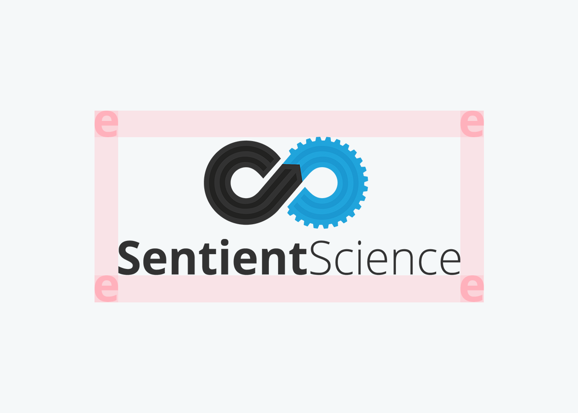
We call the space around our logo the red zone. Do not put stuff in it.
Multi Color

On light backgrounds, use our full-color logo.

On dark backgrounds, use our full-color logo with white text.
Single Color

Black logo on a light color background.
On darker colored backgrounds, use our white logo.
Platform Logo
Current state of the platform logo is as a word mark to help simplify our company branding efforts.
This is our primary platform logo. Note the horizontal lockup.
On darker colored backgrounds, use our white logo.
Taglines
A secondary tagline can be used to direct messaging to a specific user of DigitalClone. These taglines should not be confused with a product, it is just targeting the value of DigitalClone to a specific persona.
You can direct the messaging to a specific job title.
Or, you can target a specific market segment.
Clearspace
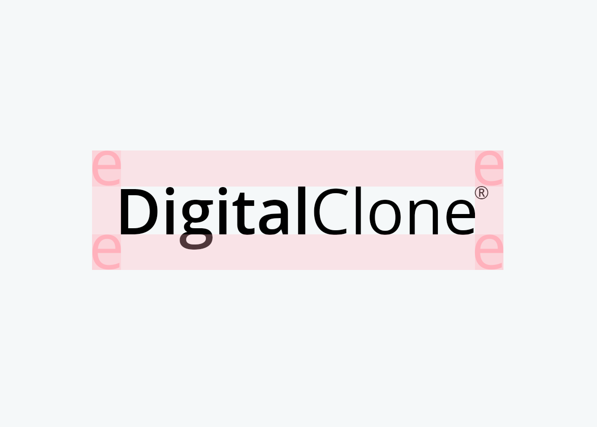
The clearspace around the logo should be equal to the "e" on all sides.
