
Accessibility
Products and web properties should be accessible to everyone, including those with vision, hearing, cognitive, or motor impairments. Accessible design lets people of all abilities interact with, understand, and navigate our products.
Keep in mind that:
- Accessibility is about having a good understanding of our user's journeys and proactively anticipating their needs.
- Accessible design is everyone's responsibility, from information and user experience design, through development, and on into help and support.
Structure & Hierarchy
Consistent, clear hierarchy helps users who navigate the page using links or headers. Use headings and titles to outline the page so that users can see the structure and how the sections relate. Give users feedback so they know where they are in the application.
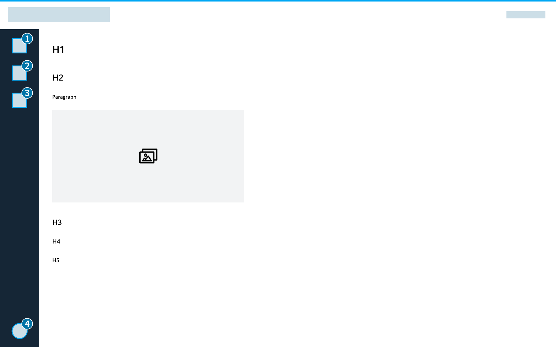
List by Level of Importance
Place items on the page in order of their level of importance so that users don't have to search for them.
Have a Consistent Hierarchy
Create and maintain a consistent hierarchy so that users can use alternative input methods to move through the page. Headings are in order without skipping levels.
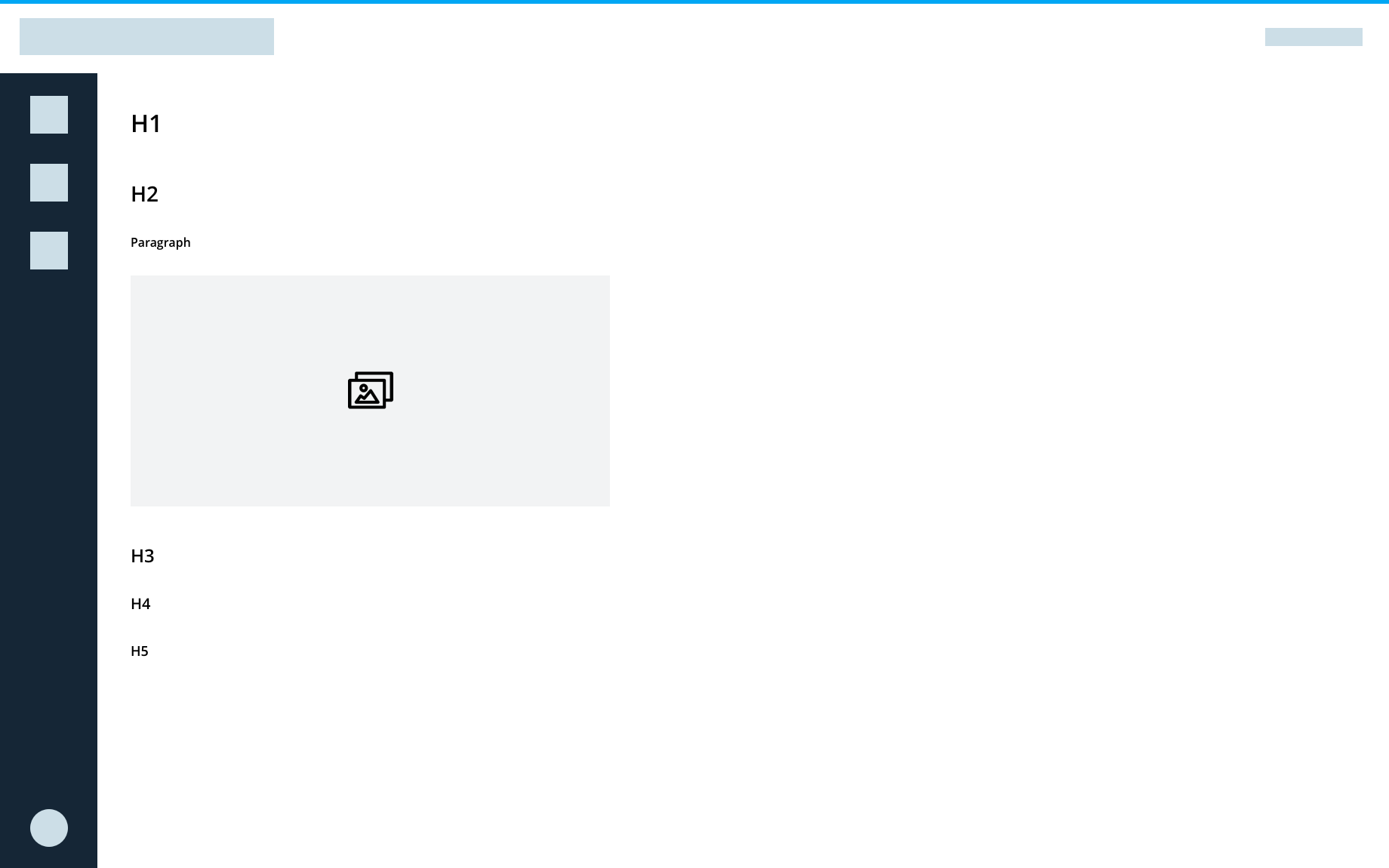
- Do: H1, H2, H3, H3, H4, H5
- Do: H1, H2, Paragraph, Image
- Don't: H2, H1, H3, H3
Text Scaling
Test the UI with color correction, magnification, and other accessibility settings to ensure the layout works with assistive settings.
Keyboard Navigation
Some users can't use a mouse, and instead navigate through applications using tools such as a keyboard, mouth wand, or eye tracking system. Users should be able to navigate and use the product with a keyboard or screenreader. Make sure anything users can see by hovering with a mouse is also accessible to keyboard focus and screenreaders.
When creating an application, ask yourself whether you can use a keyboard to:
- Navigate
- Perform the same tasks as users who use a mouse
- Tell where you are on the page
- Tell where the keyboard focus is
Manage Focus
Keyboard focus follows the page as the eye would scan it. Focus travels top to bottom, left to right, moving from most to least important item. Users can navigate applications using alternative input methods (D-pads, trackballs, keyboards, and navigation gestures), and the focus flows in a logical order.
- Be conscious of the order of elements on the page. Do they make sense from the user's perspective?
- Indicate where focus is.
- Don't use input focus to select, trigger events, or display messages. Users may need to navigate through all controls before making changes.
- Keep in mind where the focus moves when the element in focus disappears. Users should return to wherever they were before they focused on the element.
Use Tooltips
Users can activate tooltips by keyboard. When an element gets keyboard focus, a tooltip displays. When that element loses focus, the tooltip disappears.
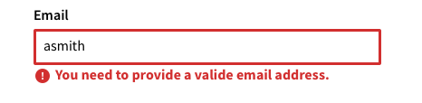
Validate Forms In-line
Validate forms in-line so keyboard users don't have to navigate far to get feedback.
Meaningful Text
Consistent and helpful text makes the user interface accessible to users who use a screen reader. Screen readers help users with visual impairments by reading both visible and non-visible alternative text aloud.
All text should support accessibility, whether it's visible (UI labels, headings, buttons, forms, hyperlinks, and help text) or non-visible (alternative text for images and buttons).
Be Concise
Keep content and accessibility text concise. People using screen readers hear every UI element read aloud, so the shorter the text, the faster they can navigate the content.
Use Consistent Labels
Consistently label elements and components that have the same functionality. When users encounter these elements in different contexts, they should be able to easily recognize and understand the function or actions of an element. For instance, a navigation item that is labelled Turbine 001 should open a page that is titled Turbine 001.
Describe What an Element Does
Label elements with action verbs that indicate what happens when the element is selected.
- Do: Edit preferences - When read aloud, the text indicates the action.
- Don't: Preferences - Just labeling the element doesn't let the user know what will happen when it is selected.
In buttons, describe what the action does, and, if you can, reveal what will happen.
- Do: Submit Inspection
- Don't: Go for it!
Hyperlinks indicate where the user will go when they select the link.
- Do: Learn more about DigitalClone Models
- Don't: Read more
Images and Video
Describe non-text elements in the UI with alternative text so that screen readers can succinctly describe images and media.
Images that Contain Information
If an image contains information that can only be understood by seeing the image, then you need to explain the content of the image using alternative text. Follow these guidelines when you write alt text:
- The text should be an adequate replacement for both the content and the function of the image.
- Determine the correct content and then deliver that message as succinctly as possible. Aim for no more than a few words, though sometimes a short sentence or two may be necessary.
- Don't repeat information that is contained in the text found on the page around the image.
- Don't use phrases like "image of ..." or "a photo of ..." to describe the image. This is apparent when using screen readers and the description itself should be enough to replace the meaning of the image.
- If the meaning and content of an image is conveyed by surrounding text, header, or captions, then you might not need as much alternative text.
Example:
<img src="example.jpg" alt="descriptive text of example image">
Decorative Images
If the image is used strictly to make the page pleasant to the eye, doesn't contain a link, and isn't used to deliver information, then include the alt attribute, but leave it empty.
Example:
<img src="example.jpg" alt="">
Videos
Provide transcripts and in-sync captioning. Make sure users can control when the video or gif starts and stops.
Colors
We comply with AA standard contrast ratios. To do this, we choose primary and secondary colors that support usability. This ensures sufficient color contrast between elements so that users with low vision can see and use our products.
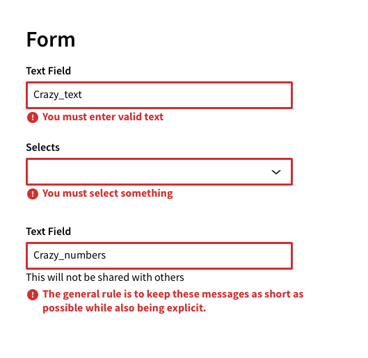
Include Visual Cues
Don't convey information using color alone. Use multiple visual cues, such as stroke weight, patterns, shape, text, or illustrations to ensure that all users receive the same information.
This helps users who are unable to, or have difficulty with, distinguishing one color from another. This includes people who are color blind, have low vision, or are blind.
For example, these inline validation messages use both color and icons to distinguish severity:
Use High Contrast
High color contrast helps users who are partially or completely color-blind see differences between certain colors. It creates a strong visual hierarchy and improves usability for everyone. Make sure that the combination of text and background color do not fall below the WCAG recommended threshold ratio of 4.5:1 for standard text and 3:1 for larger text.
Reference the Product - Colors section of the Design System for more details on contrast for specific product colors.
Decorative images and disabled states don't have contrast requirements.
Testing & Research
These guidelines will help improve accessibility in your applications, but they don't guarantee a fully accessible experience. We also recommend that you:
- Test the entire application and journeys using various assistive technologies and text scaling.
- Include users with impairments when testing.
- Ensure that the tasks in your applications can be accomplished by anyone, regardless of ability.