Layout
We folow a Mobile First Design practice. This approach puts content first and allows our team to make layout decicions easily.
Responsive Breakpoints
Through extensive user research we have selected the breakpoints that we fell best suite our users needs and minimizes our teams efforts. Each media query has it own layout challenge whicih requires specific requirement from each breakpoint.
| Window | Breakpoint | Device | Orientation |
|---|---|---|---|
| small ($sm-min) | 576px | phone | portrait |
| medium ($md-min) | 768px | phone | landscape |
| large ($lg-min) | 992px | tablets | |
| extra large ($lx-min) | 1200px | desktop | |
| extra extra large ($xxl-min) | 1440px | HD desktop |
UI Chrome
UI Chrome is the visual design elements that give users information about or commands to operate on the screen's content (as opposed to being part of that content). These design elements are provided by the underlying system — whether it be an operating system, a website, or an application — and surround the user's data.
is the user interface overhead that surrounds user data and web page content. Although chrome obesity can eat half of the available pixels, a reasonable amount enhances usability.
Reference: Nielsen Norman Group
Goals
- To maintain a consistant navigation experience across platforms and devices.
- To facilitate all different user navigation cases.
Elements
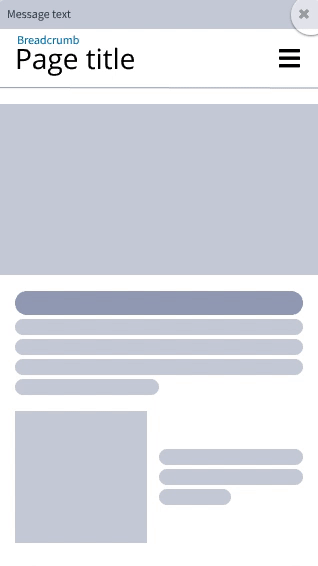
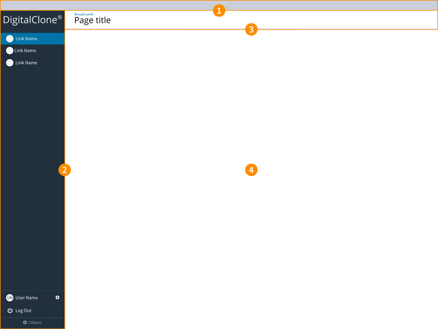
- Header: This defines the upper most part of the product. This section is displayed in order to provide notification to users or to navigate to different data sets that would modify the content of the entire application.
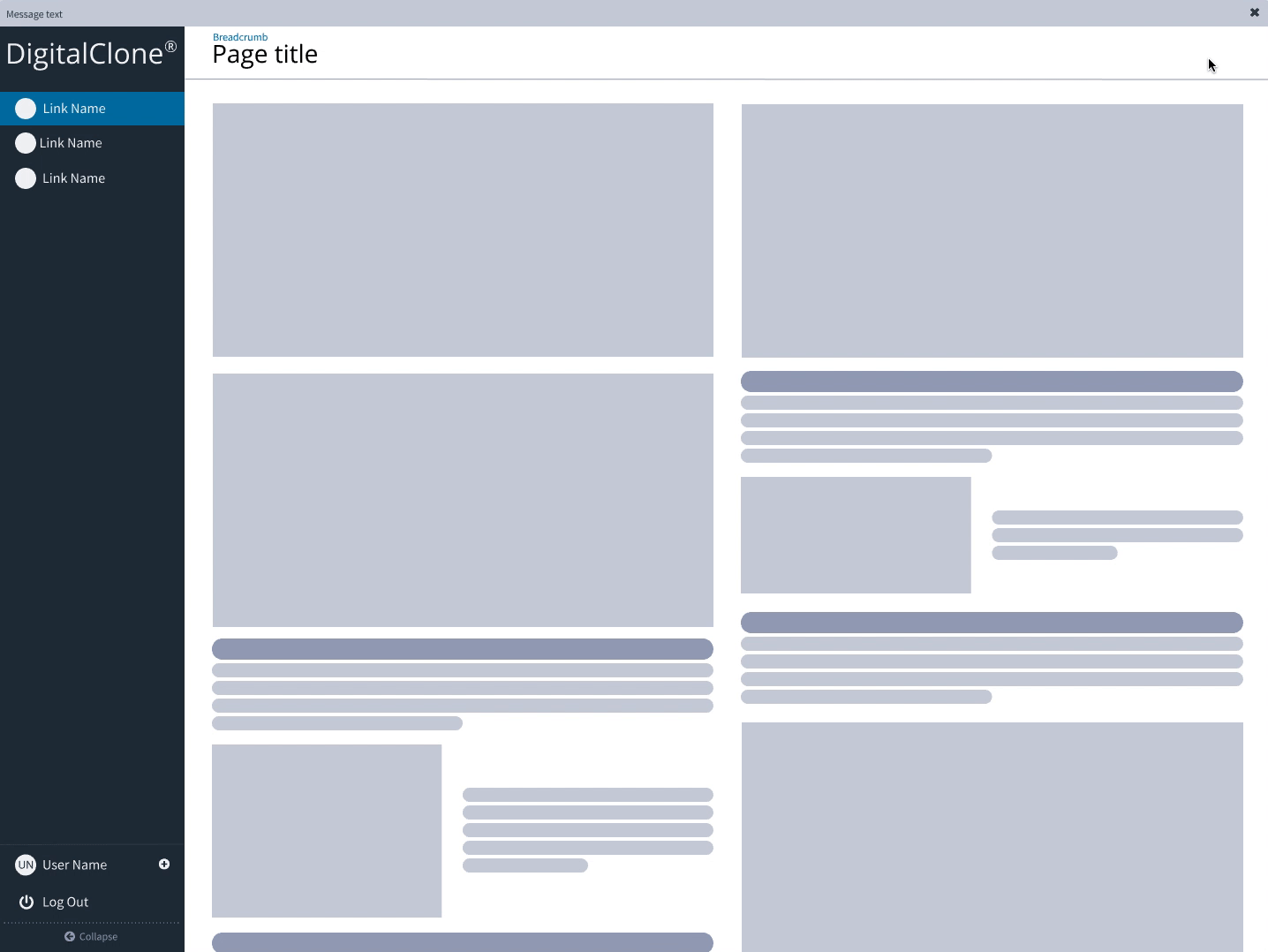
- Global Navigation or Sidebar: This will contain the product brand along with the main points of navigation.
- Main Container - Page Header: This will contain Breadcrumbs, Page Title and action buttons that would modify the main content.
- Main Container - Body: This is where the main content is located.
Usage for Desktops
The UI chrome for a desktop (over 992px) you will see the Global Navigation to left side of the screen. The layout of the branding and navigation within the Global Navigation will be consitant across all device. For the desktop display the Global Navigation will display expanded by default and can be collapsed only if the user selects this option. The expanding and collapse will alter the width of the Body.
Rules:
- Header will only display under two conditions:
- If there is alert notifications that require the user to take action.
- If the user has the ability to change the global data set of the product, a selector will appear.
- The Global Navigation is expanded by default on user login. This will give the user immediate context to what points of navigation are available.
- If the user collapses the Global Navigation they navigation names will appear via tooltip when the cursor is hovered over the supporting icon.
- The Global Navigation when expanded pushes of the Main Container, reducing container width. As the Global Navigation is collapsed the Main Container will expand in width. The Global Navigation should never overlap the content in the Main Container.
- The Main Container is...
Example:
Usage for Mobile Device
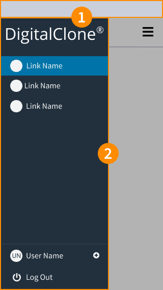
The UI chrome for a mobile device (under 992px) you will see the Global Navigation is now available by clicking the hamburger menu icon in the top right corner. This will then reveal the Global Navigation from the left side of the screen. The user will see the same branding and navigation points that they would see in the Desktop display.

Rules:
- The Global Navigation is now accessible by a hamburger menu icon that appears in the top right. Once clicked the Global Navigation will fly out from the left. In this case the navigation will overlay the Main Container. The Global Navigation will fly off the screen on click.
Example: