
Grid
Consistent use of a grid system provides the foundation for harmoniously and consistently positioning elements onscreen. Designing to the grid helps create an experience that facilitates understanding and brings order to the page.
The Basics
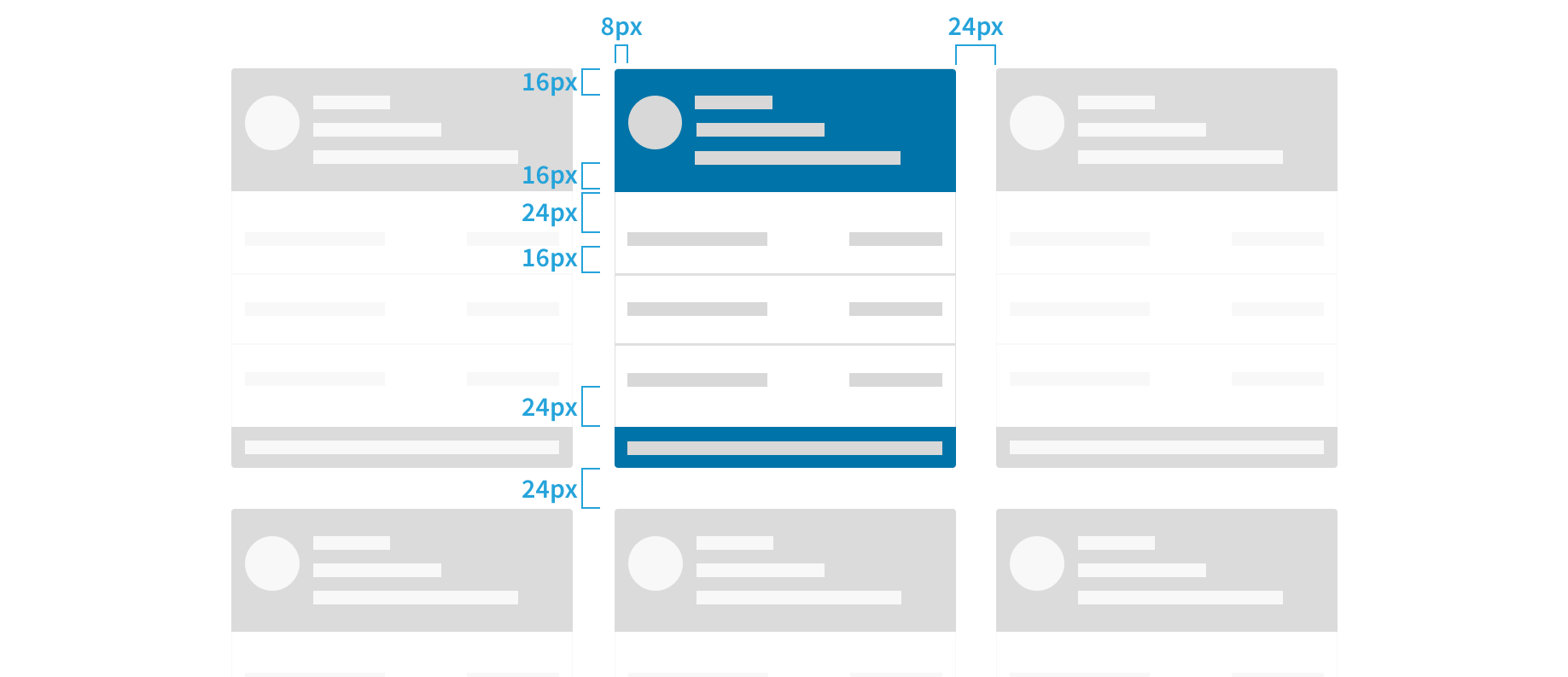
Use multiples of 8 to define dimensions, padding, and margin of both block and inline elements.
Work within multiples of 8px.
Example: 8px / 16px / 24px / 32px / 40px / 48px / 56px / 64px / 72px / 80px / etc.
4px is the baseline which this allows for more flexibility for smaller adjustements.
Baseline & Vertical Grid
The Sentient Science type stack specifies 16px for the base font size, which produces an 8px x-height. The x-height is halved to produce a 4px baseline. All text flows vertically along this baseline, creating a similar display across all screens. This consistensy is created by the line height between each line of text and the margin between elements.
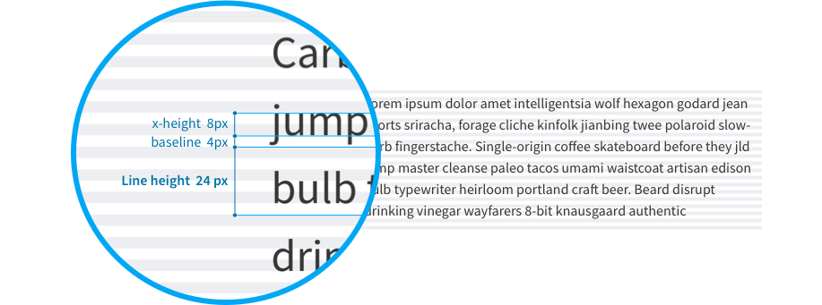
This baseline convention naturally flows on to the rest of the grid system, which includes icons, components, and layout dimensions. Always try to align objects on the 8px grid, but where necessary, use good judgement to fine tune your designs to 4px. The 4px baseline is there to allow more flexibility for line heights and smaller adjustments.

Best Practices
- Use multiples of 8px when defining measurements, spacing, and positioning elements.
- When necessary use 4px to make more fine tuned adjustments.
- Whenever possible, make sure that objects line up, both vertically and horizontally.
- Align your bounding box to the grid, not the baseline of your text.
Horizontal Grid
We define a horizontal grid for content and UI elements to align to, creating a visual structure with content. We prefer this over relying heavily on boxes and lines around content as it reduces the amount of elements a user needs to scan in order to digest what they see. We believe that the user's content should be the main focus of a page, so we reduce all unnecessary distractions.
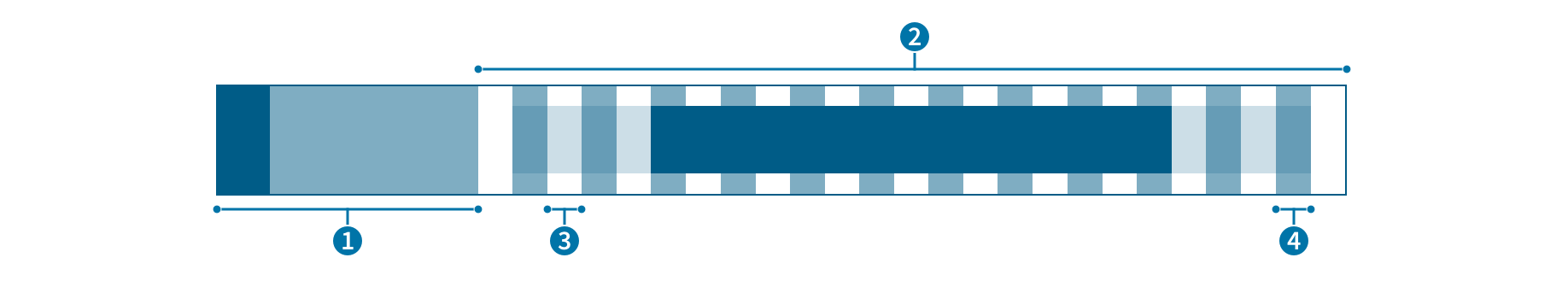
- Global navigation: Minimum width of 48px when collapsed and a maximum of 240px when uncollapsed.
- Content: Adaptive width
- Gutter: Fixed spacing between columns.
- Column: Guides which content aligns to.
In our grid system we reserve space for the navigation on the left, and apply a center-aligned 12-column adaptive layout to the content. You can apply a fixed-width or a fluid grid layout. The fixed width layout has a max-width of 960px and is useful for long form content. The fluid layout full-screen works better for screens that are data or interaction heavy.
Both layouts are adaptive. Meaning that columns widths will react to whether the navigation is expanded or not, and columns will scale according to available screen real estate. When screen drops below the max-width of the fixed layout, both grid types effectively look the same.
For more on details on grids reference the Bootstrap - Grid documentation.
Column Layout and Text
Layouts in our products are generally variable, but all stay within 12 column configuration. The simplest layout is a single block that spans 12 columns. Alternatively, the layout can be broken down into different combinations, for example: 10 and 2 or 6 and 6.
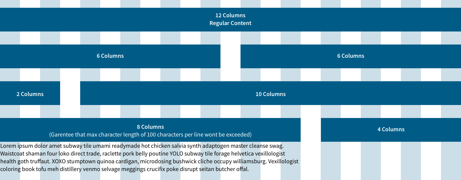
Best practices
- Keep layouts simple. Consider a single block of 12 columns or two blocks of 6 and 6 for basic layout.
- Maximum line length should span up to 8 columns, which is the ideal size for all content types. Do not go over this size for normal text.