
Buttons
Buttons are click-able items that trigger an actions. A border-radius of .25rem helps portray to the user that they are an interactive element.
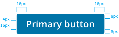
The default button size follows standard layout conventions. with the standard font size of 16px and a line height of 20px. Left and right side padding is 16px and the top and bottom padding it 8px.
Types
| Button | Description |
|---|---|
 | To call attention, or highlight, the primary action on a page. Not all pages require a primary button. A primary button should only appear once per screen (not including the application header or in a modal dialog). |
 | This is the default button that will be used in most use cases. |
 | Text buttons are used for click actions with the lowest importance on a screen. |
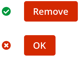
 | The danger button appears as a final confirmation for a destructive action such as deleting. these will be found in confirmation modals. |
States
States are visual representations used to communicate the status of a button.
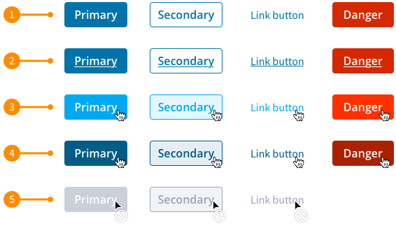
- Default: This is the standard look to the button.
- Focus: This state is important as it is used via keyboard navigation or other directional input devices. Without it, navigation from these devices is virtually impossible.
- Hover: This state is used as the cursor placed over the button.
- Active: This state is utilized as the user clicks the button.
- Disabled: This state is designed to feel muted and not stand out. This state should only be used if the user can complete the required actions. Danger button do not need a disabled state.
Writing labels
Button labels use sentence case and are as short as possible, while clearly explaining what happens when the button is activated.
Button groups
Use button groups when there is a close relationship between a number of buttons. If there is a primary button in the button group, it is to be positioned to the right.

Placement
Buttons can be located in different places depending on the use case. For main screen actions the button will be located in the top right corner of the container. For modals buttons those will be located in the bottom right of the container.
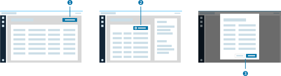
- Main Screen: Primary button that interacts with the entire screen will be located in the top right corner of the container.
- Inside Component: This example, there is a table that has add functionality. The Primary button has a plus icon and is located in the top right corner of the table container because that action will only take place to the table.
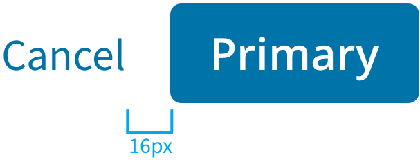
- Modal: For modals there will be two actions a Primary(submit) and a Secondary(cancel). These buttons will be located in the bottom right corner with the Secondary button on the left and Primary button on the right. There will be 1rem margin between the buttons.
In all cases buttons will have top and bottom margin of 2rem to provide spacing.