
Drawer
Navigation drawers provide access to modules within the application, and side sheets are surfaces containing supplementary content. A side sheet should be anchored to the opposite edge of a navigation drawer.
Navigation drawer
Navigation drawers provide access to modules and application functionality. They can either be permanently on-screen or controlled by a navigation menu icon. The organization of the navigation drawer is enhanced with headers and dividers.
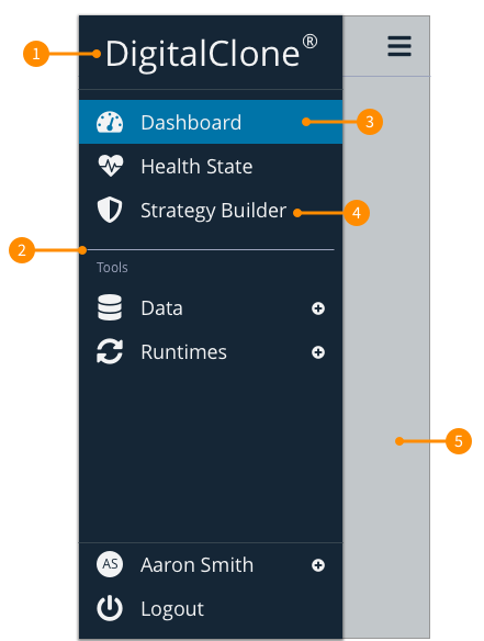
- Header: The header area of a navigation drawer is a flexible space that is used for brand expression.
- Divider: Horizontal dividers can be used to separate groups of navigation modules within the list. They extend across the the drawer.
- Active link: This identifies that active module that the user is currently interacting with.
- Standard link: This is the state of link that is not currently active for the user.
- Subtitle: Are used to identify seperate groups of links.
- Blanket (modal only): Modal navigation drawers use a blanket to block interaction with the rest of the application and provide focus on the navigation drawer and can be tapped or clicked to dismiss the drawer.
Modules
Modules in a navigation drawer take the form of actionable list items. Each item describes its module using a text label and optional iconography.
- Module labels: Text labels should be clear and short enough that they aren’t cut off by the sheet, but truncate them if they extend beyond the container width. DO NOT wrap or shrink label text to fit.
- Module iconography: When icons are used, they should always be placed before text. Other app components and content should reference these icons. When conventions exist, use recognizable icons, and DO NOT use the same icon to represent primary modules.
Side drawer
Side sheets display content that complements the screen’s primary content, and is anchored to the opposite edge of a navigation drawer (this is commonly the right side of the browser).

- Header: The header area of a side drawe is a flexible space that is used for titling the side drawer. Best practice would be to use the name of the button clicked to activate the side drawer at the title. Additionally, close functionality can be added to the header.
- Subtitle: Are used to identify seperate groups of content.
- Blanket (modal only): Modal navigation drawers use a blanket to block interaction with the rest of the application and provide focus on the navigation drawer and can be tapped or clicked to dismiss the drawer.
Layout
Modal drawer (Mobile Only)
Modal drawers block interaction with the rest of an applications content with a blanket, like a standard modal. They are elevated above the applications UI and DO NOT affect the screen’s layout grid.
They are primarily for use on mobile where screen space is limited, and can be replaced by standard drawers on tablet and desktop.
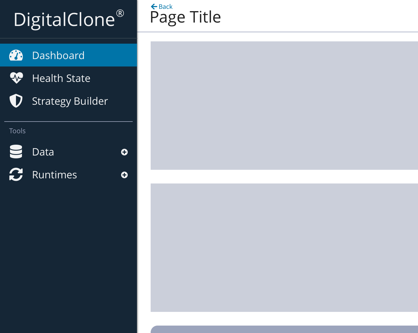
Standard drawer
Standard drawers co-exist with the screen’s primary UI region, which allows viewing and interaction with both surfaces. They are used only on tablet and desktop (breakpoint of 992px, 1200px and 1440px).
Standard side sheets are commonly used for:
- Keeping a feature or content on-screen, if the primary UI region is frequently scrolled or panned
- Contextual actions that affect the primary region, such as filters
- Short tasks that can be accomplished in a single screen, such as configuring options
Placement
Side drawer are modals on mobile devices (breakpoint of 576px or 768px), due to limited screen width, can become standard side drawers on tablet and desktop devices (breakpoint of 992px, 1200px and 1440px).
Place a side sheet on the opposite edge of a navigation drawer. The common placement is the navigation drawer is placed on the left edge and a standard side sheet is anchored to the right edge.
Behaviour
- Scrolling: Side and navigation drawers can be vertically scrolled independent of the rest of the UI. This allows their scroll position and contents to persist while the page is scrolled, and vice versa. Side and navigation drawers cannot be horizontally scrolled.