
Accordion
An accordion expands in place to expose hidden information. Unlike overlays, accordions push the page content down instead of being superposed on top of page content. It’s an immensely useful pattern for progressive disclosure — highlighting important details of a section and revealing more details upon a tap or click, if necessary. As a result, the design stays focused and displays critical information first, while everything else is easily accessible.
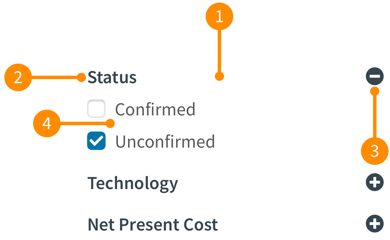
- Header: This is the area the can be clicked, or tapped, to expand or collapse the accordion. This normally contains the title and state.
- Title: This is a short and consise text that describes the content that is housed in the accordion. This is aligned to the left of the header.
- State: This is indicated by an icon that indicates if the accordion is expanded or collapsed. This is aligned to the right of the header and is indicated by a plus or minus icon.
- Content: This container is what is controlled by the header and contains the pertinent content.