
Modals
A modal is used when you need a user response, to reveal critical information, or to show info without losing the overall context of a page. No other interactions on the main page can be accessed while a modal is active.
Modals are invasive to the user's workflow as they appear above all other content. Their usage is quite powerful, as it focuses the user on a single task.
Basics
The basic modal should contain only valuable and relevant information. Simplify dialogs by removing unnecessary elements or content that does not support the users task. If you find that the number of required elements for your design are making the dialog excessively large, then try a different design solution.
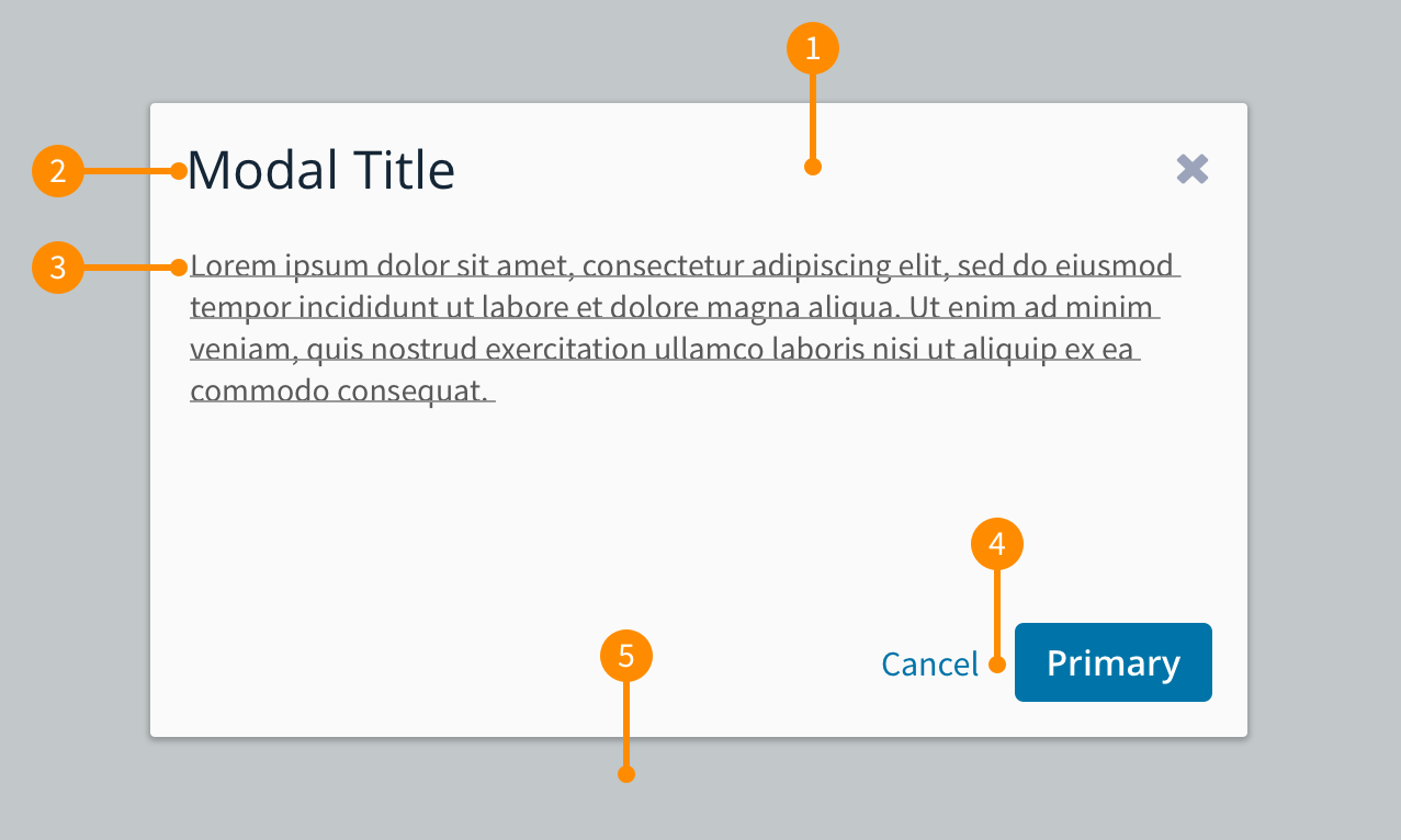
- Header: Contains the title of the modal and in some cases can provide access to additional information and functionality.
- Title: The title provides a concise overview of the contents of the modal dialog.
- Message: The contents of the dialog.
- Actions: Contains a primary action and the ability to cancel and close the dialog. Reference button documentation on the best practices to align and name these actions.
- Blanket: Provides focus on the modal. This is done by covering the content beneath so that it is not accidentally selected.
Related components
Placement
The basic modal is horizontally and vertically centered and sit at the top part of the page. This keeps the modal dialog in focus and consistent when opened across the product.
Behaviour
- Dismissing: By pressing the Esc on a keyboard, selecting anywhere on the blanket, or selecting the 'Cancel' or 'x' button on the modal dialog. This will allow for both mouse and keyboard interactions.
- Autofocus: An item is required to be auto-focused within the modal, so that the user can't tab to things below the blanket. This can be the primary action button, or if there is are input fields present then the first field.
- Scrolling: The height of a dialog is determined by the content. Once it reaches a certain threshold, the body content will scroll while the header and footer remain fixed until the bottom of the modal dialog is reached.
- Modal on modal: There may be cases where you you think this is a good idea... at this moment, stop what you are doing and walk away. It is time to consider a new approach. We DO NOT put modals over other modals.