Breadcrumbs
Breadcrumbs enable users to quickly see their current location within a path of navigation. By using the page hierarchy, breadcrumbs are easily understood by users, take up very little space on the page, and facilitate discovery. As helpful as they are, breadcrumbs should never replace the main navigation on a page.
Breadcrumbs show the hierarchical progress from the highest entity level to the lowest, one step at a time. This typically starts with the product landing page and goes to the current page or content.
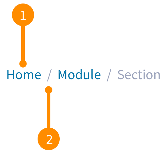
- Entity name: An entity represents a section within the page. Entity names use a text button that uses the section title to link to that section.
- Separator: Is the same font (not icon) as the rest of the breadcrumb and provides a visual distinction between individual entities.
Alignment
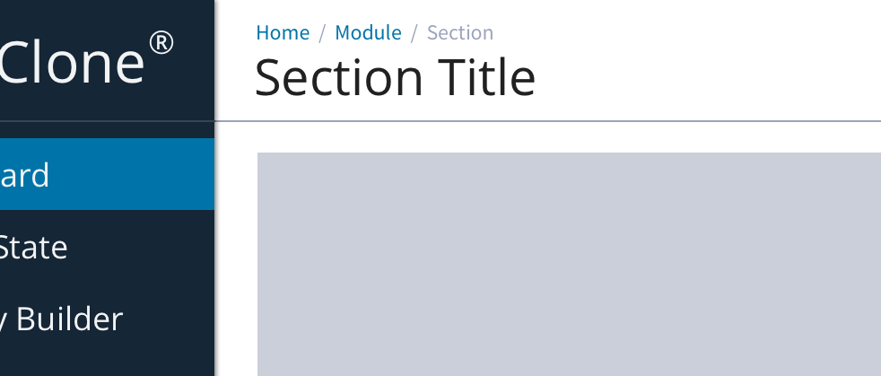
The breadcrumb is part of the UI chrome as part of the header in the top left corner of the screen, above the page title.
Desktop breadcrumb
Once a user starts diving down your previous levels will display as links, allowing back navigation. The last or current level will not be a link.
Truncation
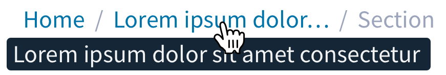
Super long entity names are truncated and a tooltip that contains the full entity name appears on hover. The length before truncation can be custom defined by pixel width.
Mobile breadcrumb
This is a simplified version of the desktop breadcrumbs with the main purpose to assist the user with navigation. Instead of a full hierarchical trail, it is used as a simple back button.
On tablet and mobile devices the breadcrumb is replace with a less-than sign (remember, no icons) and the section title of the previous page.