
Input Fields
Input fields is a UI element that is designed for entering data They should stand out and indicate that users can input information and should be clearly differentiated from one another.
Input fields should make it easy to understand the requested information and to address any errors.
Text Field
By default, input fields are required to have labels. The label is positioned above the field.
Use text fields in forms to help people enter, select, and search. Text fields are normally found within a form.
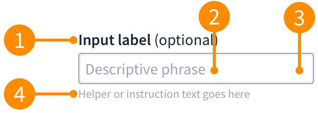
- Label: Should be positioned directly above the input field and aligned to the left. Labels indicate what sort of information the field requires and should be short and concise. Input fileds are required by default and "optional"will display next to the label when the field is not required.
- Placeholder text This lets users know what they input into the field. Only supply where clarification is required, try not to overuse it.
- Input Area: This is the area that a user inputs text.
- Helper text: Provides context about a field's input. It's best to provide an example or specific syntax for the input here, rather than in the placeholder, so that it's visible after text has been entered. Only use this where clarification is required, and try not to overuse it.
Numeric Field
Used when we are collecting a numeric value and there are no parameters or restrictions on the value.

- Number controls: This is an optional part of the numeric field that lets the user increase or decrease the value of the input.
Single Select
Single select fields direct the user to select a single input.
Radio Group
Use radio groups when you want the person to select a single option from a short list.
Radio buttons are good for describiong complex choices, this is done by providing the user all the available options next to each other. Radio groups are required to always be stacked vertically.
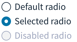
Note: By clicking on another option it will deselect the current option.
Multi-select
Multi-select fields allow the user to select multiple inputs.
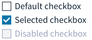
Checkbox
Checkboxes are used to allow users to select a number of options. This includes no options, a single option or multiple. Each checkbox is independent of all other checkboxes in the list, and checking one box doesn't uncheck the others.
Checkboxes require the use of a button to apply the settings once they are selected. A good example use of checkboxes is demonstrated with our filtering.
Label Requirements
Use wording that is positive/active for checkbox labels, so that it's clear what will happen if the box is checked.
Avoid statements where the user would have to check thebox for something NOT to happen.
Toggles
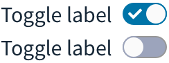
Toggles are a quick way to view and switch between enabled or disabled states. Use toggles when your intent is to turn something on or off instantly.
Toggles do not require users to press a button to apply the settings. As this is an instant action, it would be confusing to the user to require them to push a button. If a button push is a required action then use a checkbox.
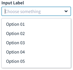
Select
The select component allows user to make a single or multiple selection from a number of options.
When a user clicks into the text input field, they trigger the selection menu, which is a list of possible options. The user can then selects a single option from that list.
The text input field updates to show the option they’ve selected.
Note: Multi-select will be defined when the use case has been defined within the application.
Label Requirements
Use a clear label for the dropdown control so that users know the purpose of the selection. When writing option labels keep to a single line of text. Be short and concise.