
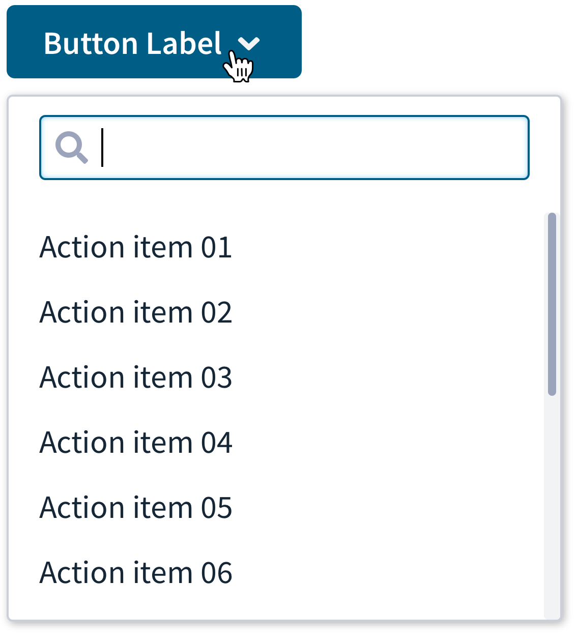
Inline Dialogs
Inline dialogs are pop-up containers for small amounts of information and/or controls that are displayed when selected by a user. They are usually triggered by buttons. Inline dialogs should be used when sections within the page require additional information or actions, but are not crucial to the page as a whole. A great use for inline dialogs is feature discovery.

- Trigger: Is a button that indicates what information the inline dialog will contain.
- Window: This is displayed once the trigger is selected and contains all of the information required for the dialog.
- Controls: Inline dialogs can feature control items such as buttons, checkboxes, and text fields. An action is not always required.
Related components
Behaviour
- Scrolling: For long lists inside the inline dialog, the content will scroll while the header remains fixed. If you need to display a lot of content or complex interactions, consider using a modal instead.
- Position: Inline dialogs can appear at the top, bottom, left or right of the trigger button with an additional 2 positions available for each location for fine tuning. This means that the location of the dialog can be placed in context with the content on the page.